Components
Carousel
Carousel used for advertising that allows marketers to place more than 1 image in a post

Selected Theme
Select brand or tribe name to preview style
Default
Usage
For use this components don’t forget to add import legion-ui
import { Carousel } from 'legion-ui';
Variant
Legion have three variant of Carousel. For using carousel you can create style first
Basic Carousel
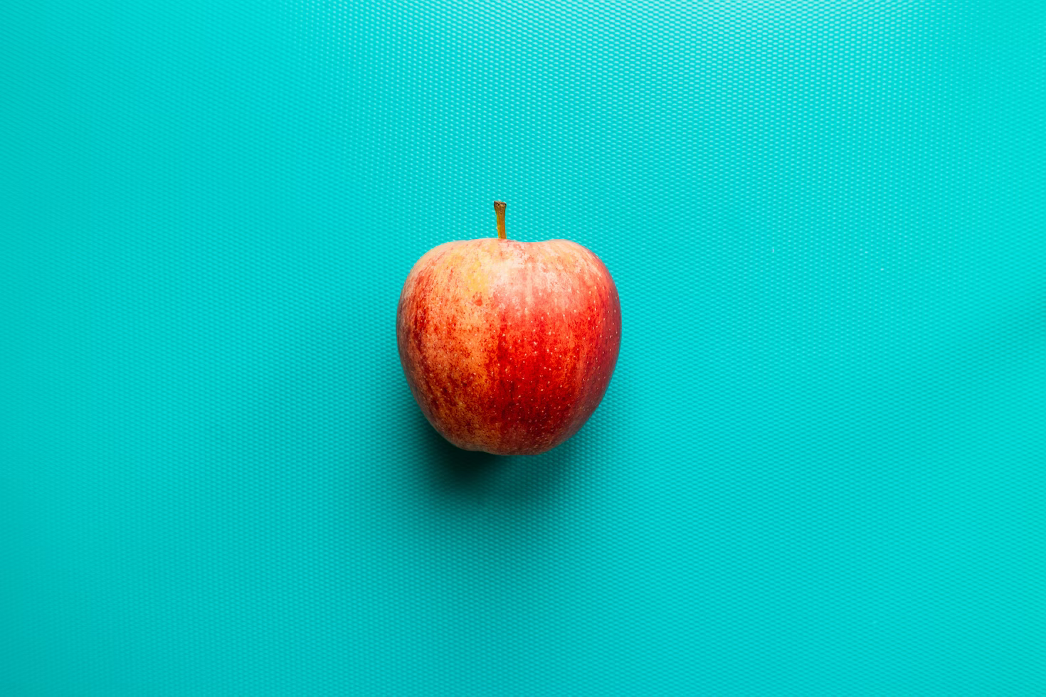
const data = [{imageURL: 'https://legion-dev.vercel.app/images/apple.png',alt: '1',},{imageURL: 'https://legion-dev.vercel.app/images/apple.png',alt: '2',},
Carousel with Indicator
const data = [{imageURL: 'https://legion-dev.vercel.app/images/apple.png',alt: '1',},{imageURL: 'https://legion-dev.vercel.app/images/apple.png',alt: '2',},
Carousel with Subtitle
Sub title
Mauris, turpis augue mauris tellus massa, lacus. Id quam adipiscing tincidunt at feugiat arcu in
Sub title
Mauris, turpis augue mauris tellus massa, lacus. Id quam adipiscing tincidunt at feugiat arcu in
Sub title
Mauris, turpis augue mauris tellus massa, lacus. Id quam adipiscing tincidunt at feugiat arcu in
const data = [{imageURL: 'https://legion-dev.vercel.app/images/apple.png',alt: '1',title: 'Sub title',desc: 'Mauris, turpis augue mauris tellus massa, lacus. Id quam adipiscing tincidunt at feugiat arcu in',},{imageURL: 'https://legion-dev.vercel.app/images/apple.png',
Example style
.wrapper {width: 500px;}
Props
| property | propType | required | default | desc |
|---|---|---|---|---|
| autoplay | boolean | - | false | Sets autoplay to slider |
| data | Array<CarouselData> | yes | - | Sets data of carousel |
| descSize | string | - | - | Sets description font size (can use px or rem) |
| showControl | boolean | - | - | Status that makes navigation or control appear or not |
| showIndicator | boolean | - | false | Status that makes indicator appear or not |
| ratio | number | yes | false | Sets image aspec ratio, same argument taken from Image component |
| titleSize | string | yes | - | Sets title font size (can use px or rem) |
Do you have feedback?
Please let us know to make it better