Components
Button
Used to initiate an action or trigger the users

Usage
Buttons are used to initiate an action or trigger the user to open a link.
Use Legion Button styles for actions in forms, dialogs, and more with support lots type and attribute for costumize.
import LegionUI
Variant
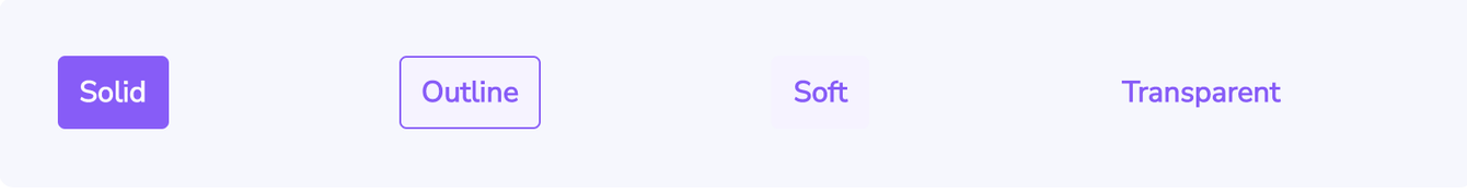
Use this Function : LGNSolidBtn, LGNOutlineBtn, LGNSoftBtn, LGNTransparentBtn and add title for the text of the button.
This code sample demonstrates how to modify the variant of the button :
A. Solid Button
LGNSolidBtn(title: "Solid")
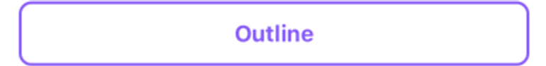
B. Outline Button
LGNOutlineBtn(title: "Outline")
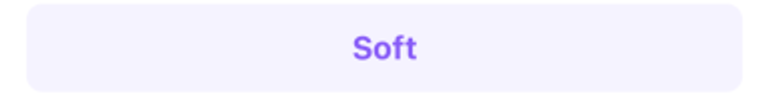
C. Soft Button
LGNSoftBtn(title: "Soft")
D. Transparent Button
LGNTransparentBtn(title: "Transparent")
Attribute
Legion Have 5 Attributes for Customize Button :
Size
This size text button attribute for user to choose size text inside the button.


Choose type botton : LGNSolidBtn, LGNOutlineBtn, LGNSoftBtn, LGNTransparentBtn and Use this Function : .variant(size: SizeBtn), where the SizeBtnconsists of normal
and small
This code sample demonstrates how to modify size text of the button :
A. Solid Small
LGNSolidBtn(title: "Solid").variant(size: .small)
B. Solid Normal
LGNSolidBtn(title: "Solid").variant(size: .normal)
C. Outline Small
LGNOutlineBtn(title: "Outline").variant(size: .small)
D. Outline Normal
LGNOutlineBtn(title: "Outline").variant(size: .normal)
E. Soft Small
LGNSoftBtn(title: "Outline").variant(size: .small)
F. Soft Normal
LGNSoftBtn(title: "Outline").variant(size: .normal)
G. Transparent Small
LGNTransparentBtn(title: "Outline").variant(size: .small)
H. Transaparent Normal
LGNTransparentBtn(title: "Outline").variant(size: .normal)
Responsive
This responsive button or boolean attribute for user to choose the button responsively to the screen / layout or not.


Choose type botton : LGNSolidBtn, LGNOutlineBtn, LGNSoftBtn, LGNTransparentBtn and use this Function : .variant(size: SizeBtn), where the SizeBtn consists of normal or small and responsive for true or false
This code sample demonstrates how to modify responsive of the button :
A. Solid Small Responsive
LGNSolidBtn(title: "Solid").variant(size: .small, responsive: true)
B. Solid Small Not Responsive
LGNSolidBtn(title: "Solid").variant(size: .small, responsive: false)
C. Solid Normal Responsive
LGNSolidBtn(title: "Solid").variant(size: .normal, responsive: true)
D. Solid Normal Not Responsive
LGNSolidBtn(title: "Solid").variant(size: .normal, responsive: false)
E. Outline Small Responsive
LGNOutlineBtn(title: "Outline").variant(size: .small, responsive: true)
F. Outline Small Not Responsive
LGNOutlineBtn(title: "Outline").variant(size: .small, responsive: false)
G. Outline Normal Responsive
LGNOutlineBtn(title: "Outline").variant(size: .normal, responsive: false)
H. Outline Normal Not Responsive
LGNOutlineBtn(title: "Outline").variant(size: .normal, responsive: false)
I. Soft Small Responsive
LGNSoftBtn(title: "Outline").variant(size: .small, responsive: true)
J. Soft Small Not Responsive
LGNSoftBtn(title: "Outline").variant(size: .small, responsive: false)
K. Soft Normal Responsive
LGNSoftBtn(title: "Outline").variant(size: .normal, responsive: false)
L. Soft Normal Not Responsive
LGNSoftBtn(title: "Outline").variant(size: .normal, responsive: false)
M. Transparent Small Responsive
LGNTransparentBtn(title: "Outline").variant(size: .small, responsive: true)
N. Transparent Small Not Responsive
LGNTransparentBtn(title: "Outline").variant(size: .small, responsive: false)
O. Transaparent Normal Responsive
LGNTransparentBtn(title: "Outline").variant(size: .normal, responsive: true)
P. Transaparent Normal Not Responsive
LGNTransparentBtn(title: "Outline").variant(size: .normal, responsive: false)
Icon


This icon attribute for user to choose the icon position inside the button.
Choose type botton : LGNSolidBtn, LGNOutlineBtn, LGNSoftBtn, LGNTransparentBtn and add title for the text of the button and icon position centerImage, leftImage, rightImage
This code sample demonstrates how to modify icon of the button :
A. Solid Button Center
LGNSolidBtn(title: "Download",centerImage: Image(systemName: "square.and.arrow.down"))
B. Outline Show Acitivy
LGNSolidBtn(title: "Download",leftImage: Image(systemName: "square.and.arrow.down"))
C. Solid Button Right
LGNSolidBtn(title: "Download",rightImage: Image(systemName: "square.and.arrow.down"))
D. Outline Button Center
LGNOutlineBtn(title: "Download",centerImage: Image(systemName: "square.and.arrow.down"))
E. Outline Button Left
LGNOutlineBtn(title: "Download",leftImage: Image(systemName: "square.and.arrow.down"))
F. Outline Button Right
LGNOutlineBtn(title: "Download",leftImage: Image(systemName: "square.and.arrow.down"))
G. Soft Button Center
LGNSoftBtn(title: "Download",centerImage: Image(systemName: "square.and.arrow.down"))
H. Soft Button Left
LGNSoftBtn(title: "Download",leftImage: Image(systemName: "square.and.arrow.down"))
I. Soft Button Right
LGNSoftBtn(title: "Download",rightImage: Image(systemName: "square.and.arrow.down"))
J. Transparent Button Center
LGNTransparentBtn(title: "Download",centerImage: Image(systemName: "square.and.arrow.down"))
K. Transparent Button Left
LGNTransparentBtn(title: "Download",leftImage: Image(systemName: "square.and.arrow.down"))
L. Transparent Button Right
LGNTransparentBtn(title: "Download",rightImage: Image(systemName: "square.and.arrow.down"))
Show Activity

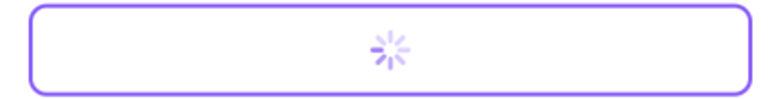
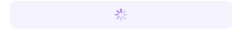

Choose type botton : LGNSolidBtn, LGNOutlineBtn, LGNSoftBtn, LGNTransparentBtn and add : .showProgressView(true) consists for true
This code sample demonstrates how to modify show activity of the button :
A. Solid Show Activity
LGNSolidBtn(title: "Title").showProgressView(true)
B. Outline Show Acitivy
LGNOutlineBtn(title: "Title").showProgressView(true)
C. Soft Show Activity
LGNSoftBtn(title: "Title").showProgressView(true)
D. Transparent Show Activity
LGNTransparentBtn(title: "Title").showProgressView(true)
Disable


Choose type botton : LGNSolidBtn, LGNOutlineBtn, LGNSoftBtn, LGNTransparentBtn and add : .disableInteraction consists for true
This code sample demonstrates how to modify disable of the button :
A. Solid Disable
LGNSolidBtn(title: "Title").disableInteraction(true)
B. Outline Disable
LGNOutlineBtn(title: "Title").disableInteraction(true)
C. Soft Disable
LGNSoftBtn(title: "Title").disableInteraction(true)
D. Transparent Disable
LGNTransparentBtn(title: "Title").disableInteraction(true)
Properties
| Properties | Description | Default Value |
|---|---|---|
| action | The action to perform when the user triggers the button. | {} |
| title | The title for the button’s title, that describes the purpose of the button’s action. | - |
| textFont | To change the font on the title button. | Font.system(size: 16, weight: .bold, design: .default) |
| tintBtnColor | To change the tint color of button. | Color.white |
| defaultBtnColor | To change the tint color of button. | Color.primary500 |
| focusBtnColor | To change the background color of the button when the button is in focus state. | Color.primary700 |
Do you have feedback?
Please let us know to make it better