Components
Accordion
Accordions are used to hide and show large amounts of content

Usage
Accordion is used to toggle between hiding and showing large amount of content
Use Legion accordion styles to modify accordion with lots of attributes that make you easier.
import ThemeAGR
Variant

Legion Have 2 Variants of Accordion :

Use this Function : LGNAccordion and add value isInitialyExpanded: true or false
This code sample demonstrates how to modify the type of accordion :
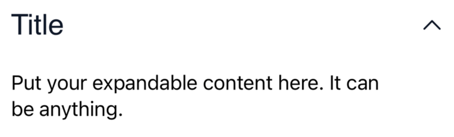
A. Expand ON
LGNAccordion("Title", isInitialyExpanded: true) {Text("Put your expandable content here. It can be anything.")}
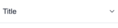
B. Expand OFF
LGNAccordion("Title") {Text("Put your expandable content here. It can be anything.")}
Attribute
Legion Have 6 Attributes for Customize Accordion :
Line
This code sample demonstrates how to modify line :
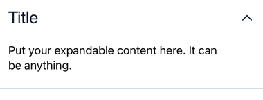
A. Accordion Line Expand ON
LGNAccordion("Title",hasBottomLine: true, isInitialyExpanded: true) {Text("Put your expandable content here. It can be anything.")}
B. Accordion Line Expand OFF
LGNAccordion("Title", hasBottomLine: true) {Text("Put your expandable content here. It can be anything.")}
Icon
This code sample demonstrates how to modify icon :

This code sample demonstrates how to modify icon :
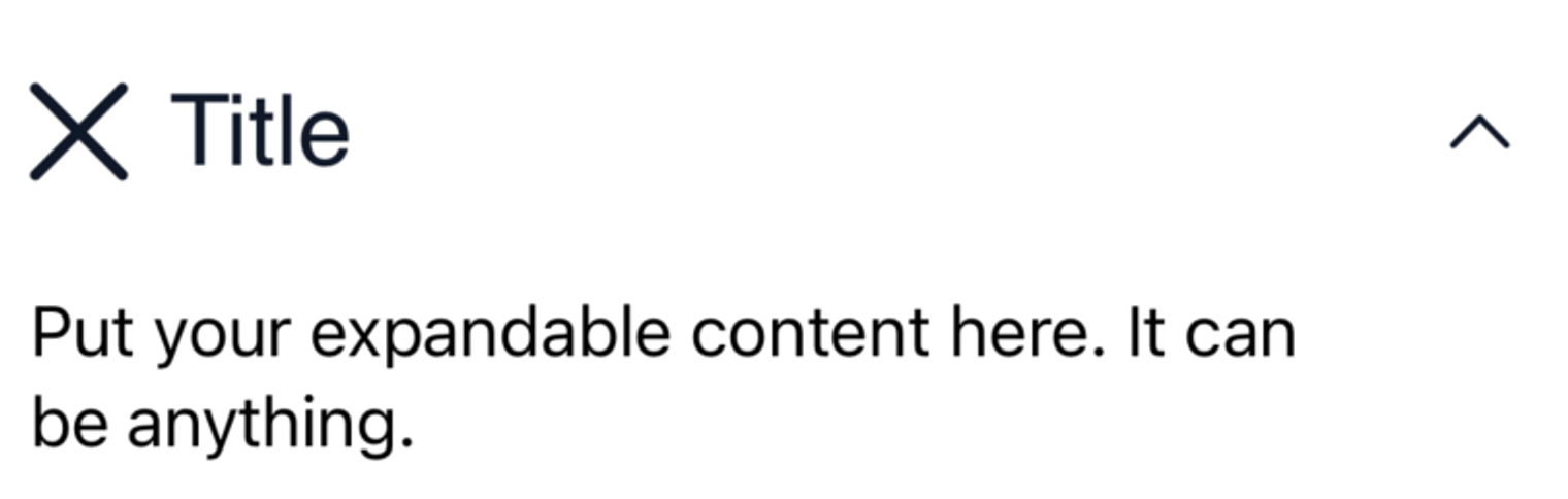
A. Accordion Icon Expand ON
LGNAccordion("Title",leadingIcon: Image(systemName: "xmark"), isInitialyExpanded: true) {Text("Put your expandable content here. It can be anything.")}
B. Accordion Icon Expand OFF
LGNAccordion("Title", leadingIcon: Image(systemName: "xmark")) {Text("Put your expandable content here. It can be anything.")}
Buttom Line Color

Add this function bottomLineColor: Color.LGNTheme.tertiary700
This code sample demonstrates how to modify bottom line color of the accordion :
LGNAccordion("Title",hasBottomLine: true,bottomLineColor: Color.LGNTheme.tertiary700) {Text("Put your expandable content here. It can be anything.")}
Background Color

Add this function backgroundColor: Color.LGNTheme.tertiary700
This code sample demonstrates how to modify background color of the accordion :
LGNAccordion("Title", backgroundColor: Color.LGNTheme.tertiary300) {Text("Put your expandable content here. It can be anything.")}
Font Header

Add this function tintColor: Color.LGNTheme.tertiary900
This will affect icon, title, and chevron.
This code sample demonstrates how to modify font header color of the accordion :
LGNAccordion("Title",tintColor: Color.LGNTheme.tertiary900) {Text("Put your expandable content here. It can be anything.")}
Font Family

Add this function tintColor: Color.LGNTheme.tertiary900
This will affect icon, title, and chevron.
This code sample demonstrates how to modify font header color of the accordion :
LGNAccordion("Title", titleFontFamily: "Verdana-Italic") {Text("Put your expandable content here. It can be anything.")}
Properties
| Properties | Description | Default Value |
|---|---|---|
| title | the main text string you want to display on accordion header | - |
| titleFontFamily | fontFamily of your title | "" |
| leadingIcon | the Image() you want to display on the left hand side of your header text | nil |
| hasBottomLine | the boolean to decide whether or not the accordion has bottom line | false |
| bottomLineColor | your bottom line’s color | Color.LGNTheme.tertiary300 |
| backgroundColor | your accordion’s’ background color | .white |
| tintColor | color tint for your header’s icon, title, and chevron | Color.LGNTheme.tertiary900 |
| isInitialyExpanded | whether or not the accordion is initially displayed as expanded or collapsed | false |
Example Project
LGNAccordion("Title",titleFontFamily: "Verdana-Italic",leadingIcon: Image(systemName: "xmark"),hasBottomLine: true,bottomLineColor: Color.LGNTheme.tertiary300,backgroundColor: .white,tintColor: Color.LGNTheme.tertiary900,isInitialyExpanded: true) {Text("Put your expandable content here. It can be anything.")
Do you have feedback?
Please let us know to make it better